
No products in the cart.
Trade Show Color Psychology: Choosing Booth Colors for Your Brand and Audience
Choose trade show booth colors to make the offer recognizable, the information readable and the products easy to inspect. Exhibition color psychology can inspire creative questions, but it should not become a universal rule that one hue creates trust or another guarantees more visitors.
Your existing brand, the surrounding hall, the product and the printed material all affect the choice. Use a structured test with physical samples rather than selecting a palette solely from symbolic color descriptions.
Start with the brand system
Identify the approved logo colors, supporting palette and any restrictions on backgrounds or reversed logos. Ask for production references where they exist. If several teams have used different versions of the palette, resolve that before the booth artwork is built.
A booth should be recognizable alongside your website, product packaging and sales material. That does not require covering every wall with the main brand color. Decide which surfaces identify the brand and which provide a quieter setting for information or products.
Assign roles to colors
Use the palette as a system of roles: background, headline, product area, navigation and call to action. Repeating a role consistently can help visitors understand the exhibit even when they approach from another side.
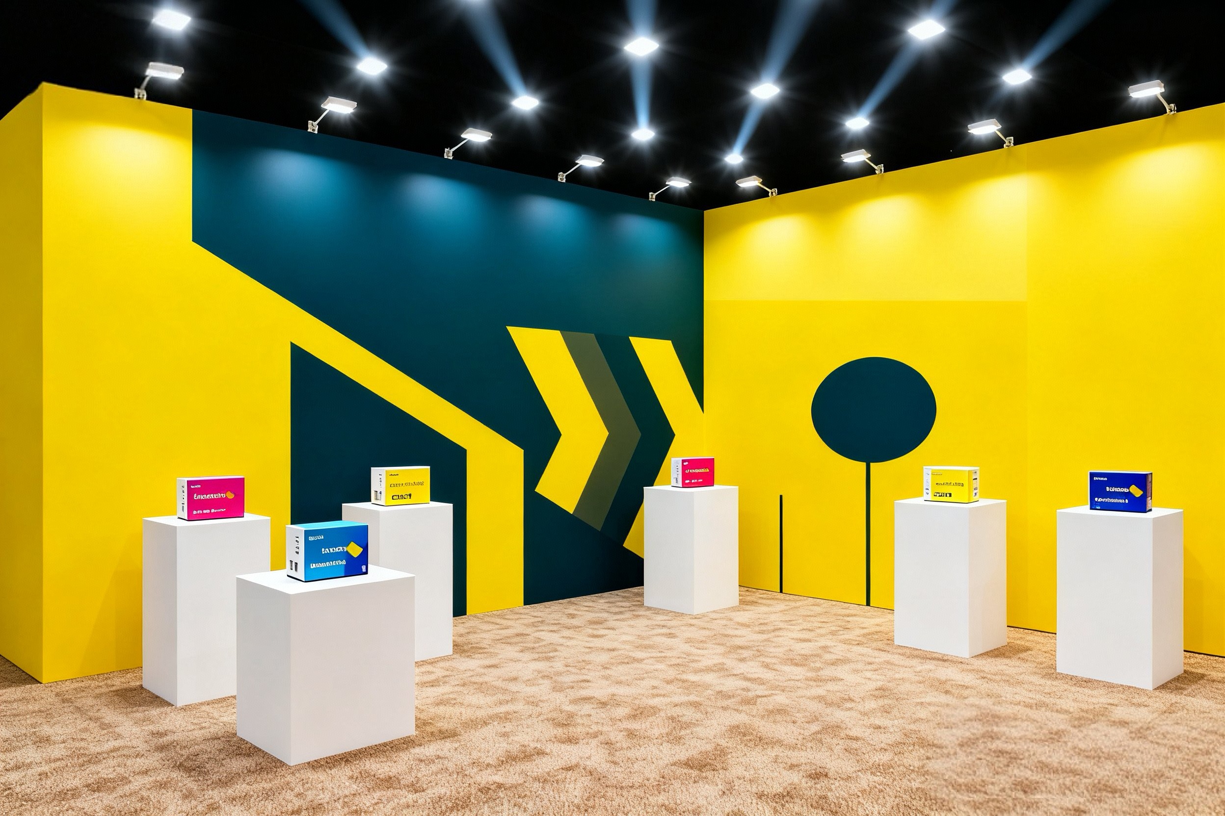
For example, a proposed design might use a dark background for brand identification, a lighter surface behind technical details and a distinct accent around the demonstration prompt. This is a design option to test, not a claim about how every audience responds to those colors.
Avoid assigning competing meanings to the same accent. If it marks both the entrance and a staff-only storage panel, it may not help orientation.
Test contrast with the actual information
Place the final headline, labels and icons on the proposed backgrounds. Review them from the intended viewing distances and under the planned lighting. Do not judge a palette using empty color swatches alone.
Check fine lettering and text over photographs carefully. If the background changes behind a word, readability may vary across the line. Give important information a stable visual field where needed.
Also make navigation understandable without color alone. Pair color-coded product zones with words or symbols so the distinction remains useful to more visitors.
Consider the product against the wall
Put a representative product or its packaging in front of the sample background. Check its edges, labels and reflective surfaces. A palette that works for a brand headline may obscure a small item placed on a display shelf.
If visitors need to judge product color, evaluate the lighting and surroundings together. Decorative colored light may be useful for atmosphere but should be reviewed separately from the conditions needed to inspect a product accurately.
Approve the palette on the proposed print system
A custom printed fabric booth involves material, ink, finishing and illumination. Ask the supplier how to approve the important colors on that combination. Review the sample in the intended backlit or front-lit state.
Keep the approved reference with the production specification. When replacing one panel of a fabric display wall, provide the original job details and ask how a new print can be compared with retained graphics. An old panel and a new panel should be assessed together before the event.
Compare two concepts with a useful test
| Test | Ask the reviewer |
|---|---|
| Brand recognition | Which company or offer does this appear to represent? |
| Message clarity | What do you understand first? |
| Product visibility | Which item is being presented? |
| Visitor action | Where would you go to engage? |
| Legibility | Which information is difficult to read? |
Keep the wording, layout and image selection consistent when testing a color change. If everything changes at once, you cannot isolate what caused the reviewer's response.
Treat event results carefully
If you compare palettes across events, record differences in audience, location, staffing and offer. More inquiries at one event do not prove that a color caused the increase. Use the evidence to inform the next design rather than turning it into a universal conversion claim.
Frequently asked questions
Which color attracts the most visitors? There is no reliable universal answer for every brand, hall and audience. Test the palette against the actual communication task.
Should I avoid dark walls? Not automatically. Evaluate contrast, product visibility and the complete setting.
Can I choose colors from a screen alone? Use screen concepts for development, then follow the printer's physical proofing process for important color decisions.
Send QuicklyShow your brand references and intended display system to discuss graphic production for your booth palette.
